Why bolder is better, how the letter “a” can be a tattoo’s downfall, and more tips from seasoned tattoo artists. 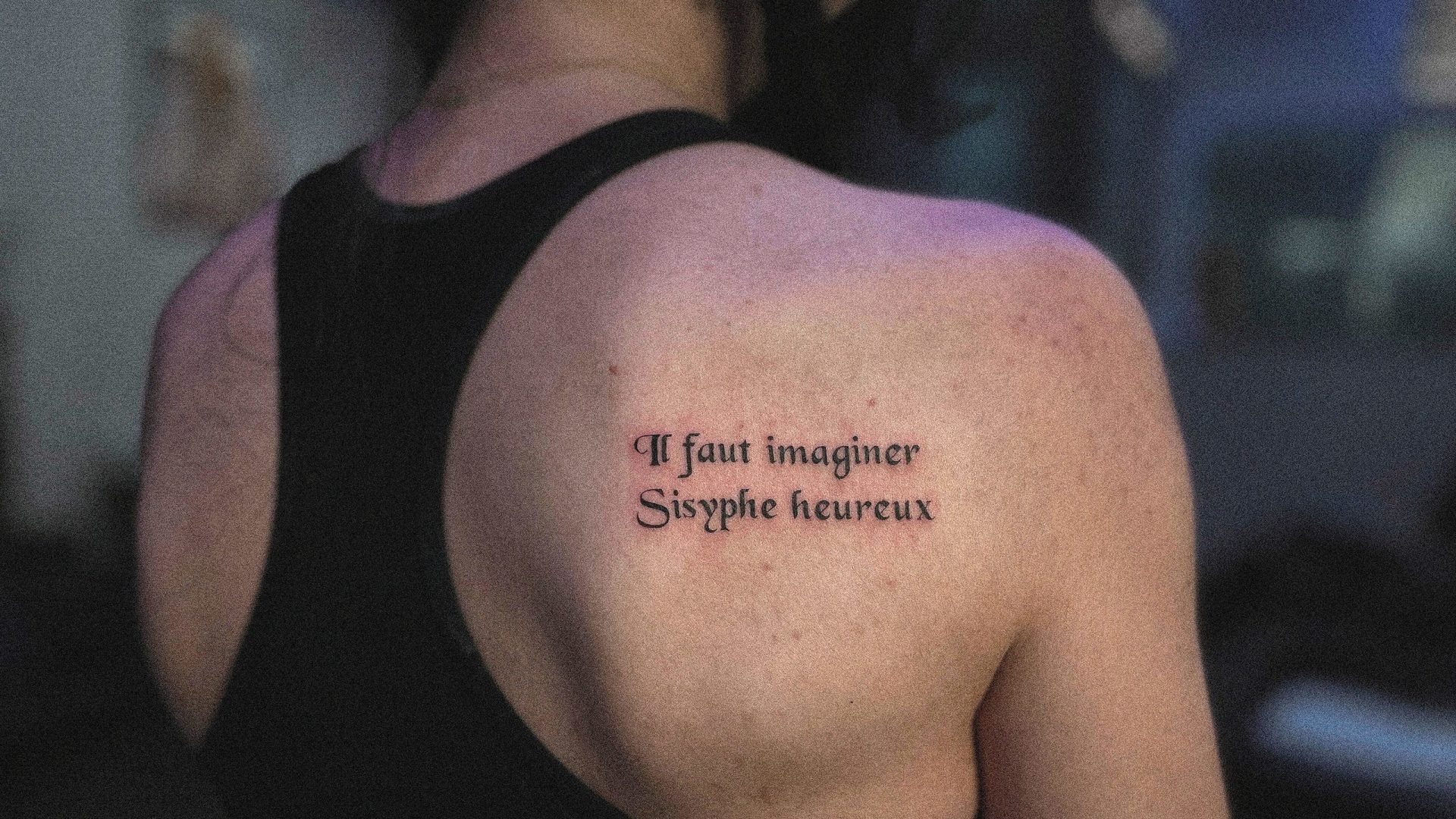
Tattoos are, in the most obvious terms, a commitment. They’re on your body forever, so dreaming up designs you’ll be excited about for life can be a tall order. There are seemingly endless options when it comes to styles, colors, and artists, which means you’ve got room to explore. And seemingly every day our favorite celebs debut new ink, sparking even more inspiration for your next design. But all that possibility can make it tough to nail down your final choice, and even if you have some ideas about the words you want inscribed on your skin, finding the perfect font can be one of the hardest choices you’ll make at the tattoo parlor.
Maybe you’re enamored with some old-school block lettering, or perhaps you’ve got a saved folder full of script and handwriting on your Instagram. You might just be looking for a new font that will play well with your existing ink. Whatever your dilemma, we consulted experienced artists to pull together the ultimate guide to picking a tattoo font.
Placement is key when deciding which direction to go with your design. “I’d think about where you want to put it first, and how you’re thinking you want it to look on your body,” says Gabby Pignanelli, a tattoo artist at Inked NY in New York City. This includes considering “high traffic areas,” or places on your body that frequently come in contact with your clothes, shoes, and the lines.
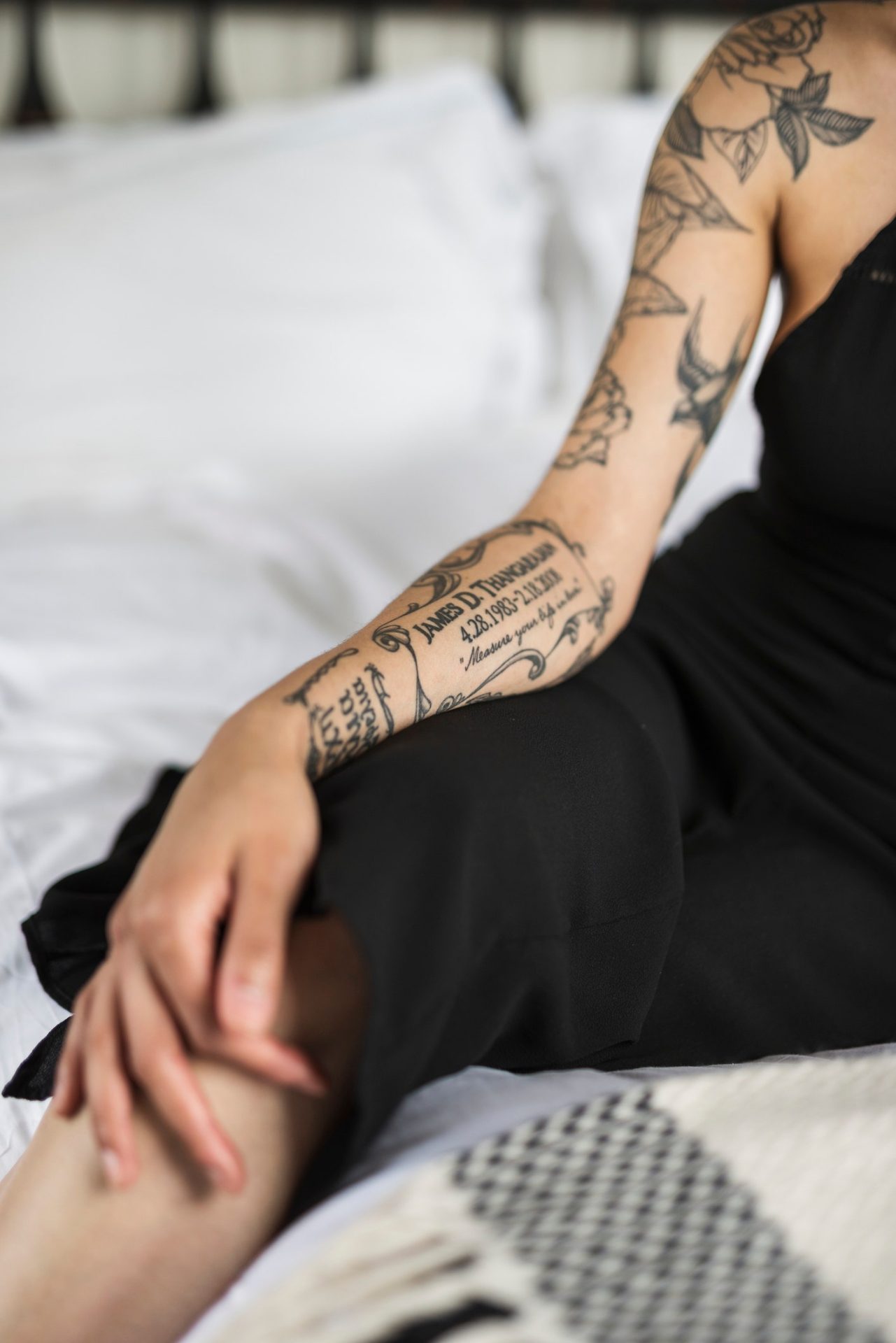
“If you’re going to go with the fine line [style] on your hands or your feet where there’s more friction, you’re going to run the risk of it falling out a little bit and needing some touch-ups,” she explains. “Bolder [fonts], especially on your hands, can work a little bit better in the long run, but it’s all about personal preference.”
Brit Bauzá, a tattoo artist at Brooklyn Ink in Bay Ridge, NY, agrees that the fingers and the feet would end up requiring more touching up than other areas. She also notes that no matter what, tattoos will age and change, just as our bodies do.
“Over time they’re always going to spread a little bit. The body is always aging, no matter what,” she says, explaining that’s why she tends to tattoo fonts on the thinner side to improve their appearance over time. “If you start a little bit smaller as it starts to spread, it won’t get too thick as it stretches and moves with the body.”
Consider sizing up.
While super tiny tattoos seem more popular than ever, when it comes to certain fonts or styles of script, it’s worth considering going bigger than you might have originally planned. “One of the things I might come across is not being able to do it as small [as the client wants.] That’s very common with first-timers,” says Bauzá. “These photos of these micro tattoos are beautiful online, and it’s great for the photo, but then years later, it’s too small as it ages.”
She also notes if you’re getting script and the words contain letters that have openings, like As or Os “smaller than the tip of your fingernail, that’s not going to age well if it spreads a little bit over time.” For artists and clients alike, “aging well” means remaining legible as years pass, and fading in a more minor, consistent, and pleasing way. Pignanelli confirms that she, too, runs into this sizing situation with tattoo newbies, or when clients ask for words that are particularly delicate. She notes that specific letters may help sway your decision.
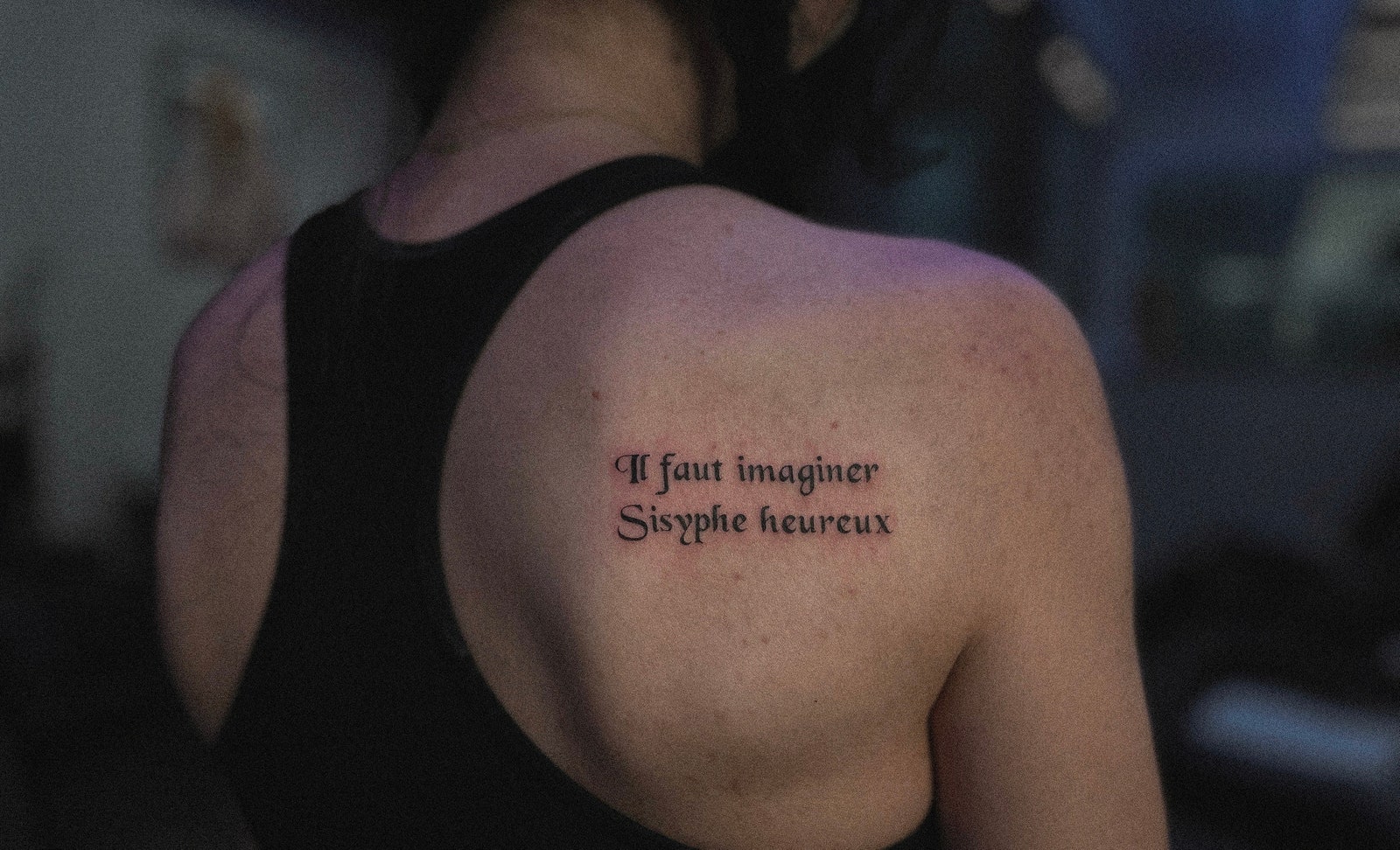
Courtesy of Gabby Pignanelli
“I have a bunch of really small tattoos myself. But I always give people the warning that if you’re getting something that has an O in it, for example, just be cognizant of how that’s going to be like 10 years from now,” says Pignanelli. While some clients may be concerned with legibility in the coming years, some may be just fine with the inevitable fading tattoos are prone too.
“There’s a saying in the tattoo community: bold will hold. And it is true — even though everything spreads over time, bold lines tend to be the most legible over time,” explains Pignanelli, but notes that again, personal preference and talent of the artist are key when making this decision. “That being said, I’ve seen a lot of fine line tattoos that have healed so beautifully and have lasted over the years.”
Look for artists on Instagram — but pay attention to their posts.
The ‘gram is an endless source of inspiration when it comes to tattoos, and if you’re like us, you’ve got a folder full of ideas from artists around the world. But as with everything else, looks can be deceiving. When you’re scrolling through an artist’s page, Pignanelli suggests checking out both artists’ grids and their tagged posts to get a full picture of what their work looks like — both when the ink is fresh, and when it’s had weeks or months to heal up.
“Artists posting healed work is a good sign,” she says, noting that tattoos — especially tiny, delicate ones — can look great in the moments after tattooing, but may not look as crisp after they’re healed. What’s more, Pignanelli says some artists have actually been busted for editing photos of their clients’ tattoos. (For clarity, tweaking photos for consistency or visibility is standard, but doctoring the appearance of the actual tattoos is not.)
“Instagram is such a good marketing resource, right? You can put whatever on your Instagram,” she explains. “That’s another reason why I’ve started really encouraging people to look up [artists’] healed stuff, or even things that people have tagged them in.”
Honestly, just ask your artist for guidance.
Tattoo artists are, obviously, pros when it comes to looking at a person’s body and designing art around it. And if your artist is experienced, chances are they’ve got their own arsenal of fonts at the ready to help their clients achieve their ideal result.
“I personally have a ton of folders full of fonts on my hard drive and I’ve been kind of slowly importing them so that I can pull them up as I’m sitting with [a client,]” says Pignanelli. Artists often use font generators, and you can take advantage of them at home, too. Both Bauzá and Pignanelli recommend DaFont as an expansive source of font inspiration.
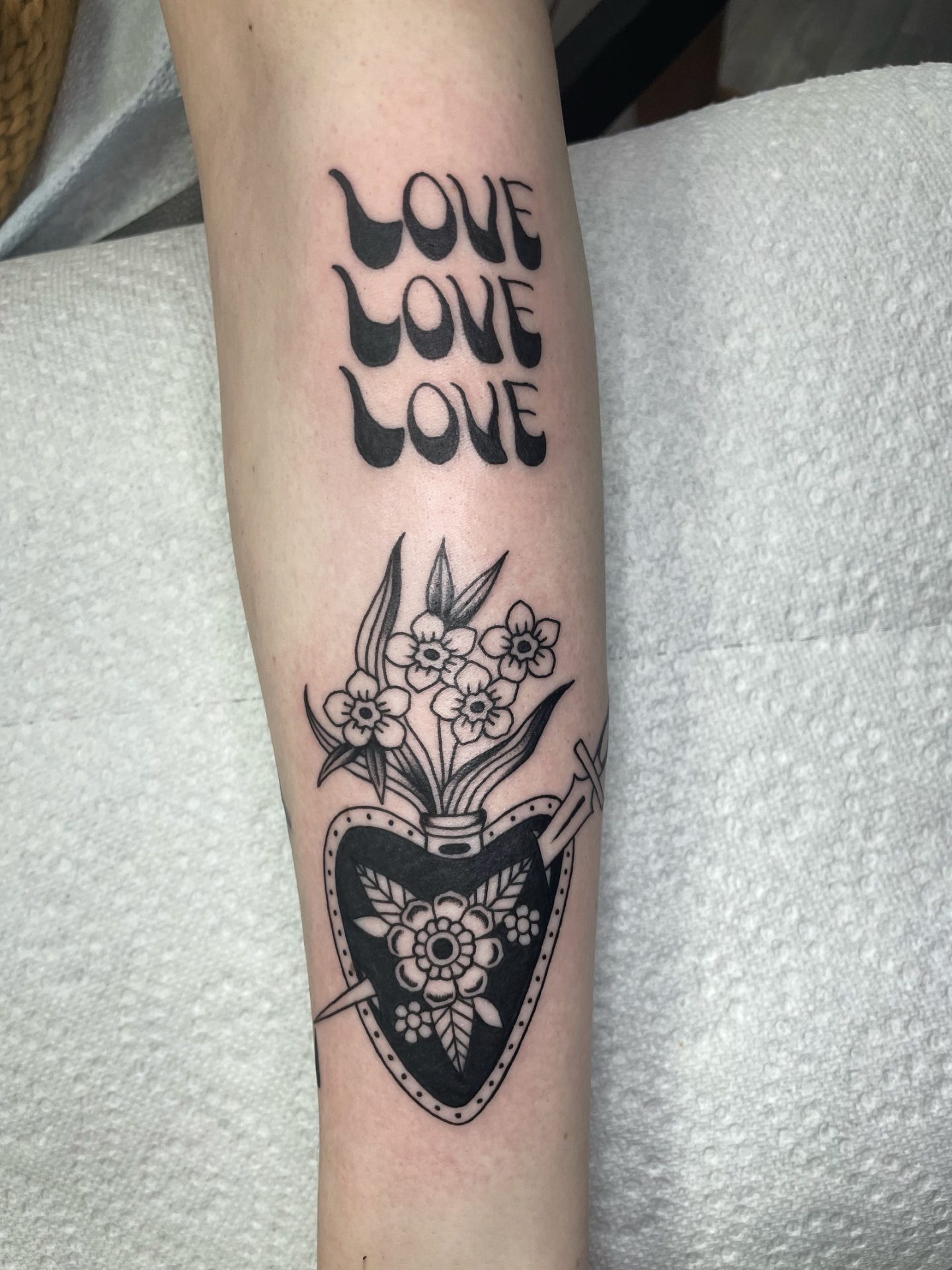
Courtesy of Brit Bauzá
Courtesy of Brit Bauzá
Reference photos are also incredibly useful for steering your artist towards what you want. When working with a client who hasn’t nail down a font, Pignanelli likes to talk things through. “I’ll look at reference photos that people send me and say, ‘I like this tattoo,’ and I’ll be like, ‘Why?'” she says, and adds that if the client already has tattoos, she’ll think about which fonts may play nicely with those.
Bauzá also notes regardless of placement, script or fine line tattoos might need touch-ups in the early weeks after healing. “Everyone’s different; it could take one to three weeks to heal. You usually know by the time it’s done scabbing if you’re going to need a touch-up.”


